Band 5.0 IELTS Writing Task 1 Model Answer
Overall Band Score: 5.0 · Cambridge IELTS 15 · 2026-11-16
IELTS Writing Task 1 question
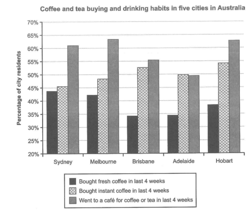
The chart below shows the results of a survey about people’s coffee and tea buying and drinking habits in five Australian cities.
Summarize the information by selecting and reporting the main features, and make comparisons where relevant.
Student answer (Band 5.0)
This given chart shows the results of a survey about people's coffee and tea buying and drinking habits in five Australian cities.
Firstly the according to the survey, The Highest amount of percentage of every city residents went to a cafe for coffee or tea in last four weeks. Where the lowest amount of percentage of every city residents bought fresh coffee in last four weeks. In Melbourne, 63% of people went to a cafe for coffee or in last 4 weeks. Where in Hobart there were no huge difference of percentage of people who went to cafe for coffee in last weeks. Moreover, there were 62% people went to a cafe. Furthermore, In Brisbane and Adelaide there were low amount of percentage of city residents who bought instant coffee in last four weeks.
To conclude, Mostly people liked to went to a cafe rather than bought instant or fresh coffee in last four weeks.
AI examiner evaluation
| Criterion | Band |
|---|---|
| Task Achievement / Task Response | 4.5 |
| Coherence and Cohesion | 4.5 |
| Lexical Resource | 5.0 |
| Grammatical Range and Accuracy | 5.0 |
| Overall | 5.0 |
Task Achievement / Task Response: Band 4.5
You identify the chart’s subject and report some relevant comparisons, including café visits in Melbourne and Hobart. However, the overview is inaccurate: café attendance is not the highest activity in every city, since in Adelaide instant coffee purchases (about 50%) slightly exceed café visits (about 49.5%). Fresh coffee is not the lowest category everywhere either; in Brisbane and Adelaide, fresh coffee is below café visits but the overall pattern needs clearer, accurate comparison. The claim that instant coffee was low in Brisbane and Adelaide is also misleading, as it reached about 53% and 50%. The response is 144 words, six short of the 150-word minimum, with 11 prompt words excluded. Include a fuller overview and select accurate key figures.
Coherence and Cohesion: Band 4.5
The response has a basic sequence: it introduces the chart, gives a few observations, and ends with a concluding statement. However, the ideas do not develop in a clear comparison across the five cities, and the paragraph beginning “Firstly” combines several claims without a consistent organising principle. Linking words such as “Where,” “Moreover,” and “Furthermore” are used mechanically; “Where” does not connect the clauses correctly, and the transitions do not clarify how the figures relate. The conclusion repeats the broad café preference rather than synthesising the data. Grouping the information by activity or by cities, then using clear comparisons between the highest and lowest figures, would make the progression easier to follow.
Lexical Resource: Band 5.0
You use relevant topic vocabulary, including “survey,” “percentage,” “residents,” and “bought fresh coffee,” so the subject is generally understandable. However, the range is limited and several phrases are repetitive or unnatural, such as “highest amount of percentage” and “low amount of percentage.” “No huge difference” is vague for describing two similar figures, while “liked to went” does not express the intended preference naturally. Use concise chart language such as “the highest proportion,” “a relatively small difference,” and “the share of residents.” More precise verbs, including “visited,” “purchased,” and “accounted for,” would also help you describe the categories without repeatedly copying the chart labels.
Grammatical Range and Accuracy: Band 5.0
You attempt both simple statements and longer sentences, and the main topic can usually be understood. However, the range is limited, and errors recur in sentence construction, verb forms, articles, and punctuation. For example, “Firstly the according to the survey” has a faulty opening, while “people liked to went” combines incompatible verb forms. The sentence beginning “Where the lowest amount…” is a fragment, and “there were 62% people” uses an incorrect structure for reporting a percentage. Capitalisation is also inconsistent, as in “The Highest” and “In” after sentence-internal transitions. Practise complete clauses and reliable reporting patterns, such as “The proportion of residents who visited a café was 63%,” and check verb forms and sentence boundaries.
See this exact question answered at other band scores. The same prompt compared across bands.
Browse more IELTS Writing model answers or get your own writing scored by the same AI examiner.