Band 6.0 IELTS Writing Task 1 Model Answer
Overall Band Score: 6.0 · Cambridge IELTS 15 · 2026-11-16
IELTS Writing Task 1 question
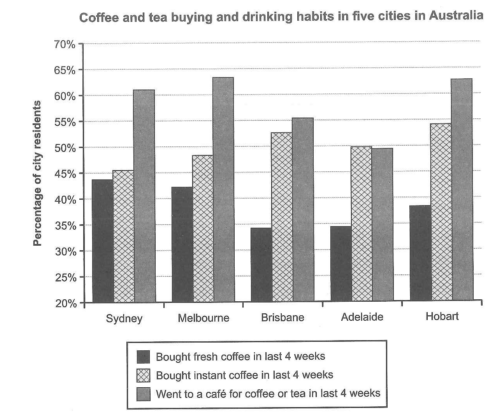
The chart below shows the results of a survey about people’s coffee and tea buying and drinking habits in five Australian cities.
Summarize the information by selecting and reporting the main features, and make comparisons where relevant.
Student answer (Band 6.0)
The graph demonstrates the buying and drinking routines of people in five towns in Australia.
Overall, apart from Adelaide, the people in other four cities preferred going to cafe for drinking coffee or tea and instant coffee was their second choice. Fresh coffee was the least favourite choice across all cities.
Almost 63% people of melbourne went to cafe for drinking in last 4 weeks which make them the majority, and Hobart and Syndey hold the second and third position with 62% and 61% respectively. A different scenario was seen in Adelaide with only 49% people going to cafe which is the least among the cities.
A different scenario was seen in case of buying. Almost 54% people from Hobart bought instant coffee securing the highest position and Brisbane being second with 53%. The people of Adelaide preferred buying instant coffee than going to cafe. Sydney residents bought the lowest amount of instant coffee.
Buying fresh coffee was not popular in any of the cities but Sydney people mostly bought it, almost 44% of them. It was least bought in Brisbane with only 34% people buying it.
Thus, it can be said that, people liked to go to cafe.
AI examiner evaluation
| Criterion | Band |
|---|---|
| Task Achievement / Task Response | 6.0 |
| Coherence and Cohesion | 6.5 |
| Lexical Resource | 6.0 |
| Grammatical Range and Accuracy | 5.5 |
| Overall | 6.0 |
Task Achievement / Task Response: Band 6.0
You identify the main pattern that café visits were highest in most cities and that fresh coffee was generally the least popular option. Several comparisons are also relevant: Hobart led in instant coffee purchases, while Sydney had the highest fresh-coffee figure. However, the overview is not fully accurate: instant coffee was not the second choice in all four cities besides Adelaide, since in Sydney café visits were highest and instant coffee (45.5%) was only slightly above fresh coffee (44%); more importantly, Adelaide’s café figure was marginally below its instant-coffee figure, not clearly a different preference. Some details are omitted, including Melbourne’s high café figure and the close café results for Hobart and Melbourne. Report the main patterns more precisely and avoid unsupported claims such as “people liked to go to cafe” as a final conclusion.
Coherence and Cohesion: Band 6.5
The response has a clear overall arrangement: an introduction and overview are followed by paragraphs on café visits, instant coffee, and fresh coffee. This makes the information easy to follow, and phrases such as “A different scenario” signal a shift in focus. The organisation is coherent, but progression is not always fully controlled: the café paragraph gives a ranking, while the later paragraphs do not consistently compare all cities or connect the three categories. “Thus” introduces a conclusion that largely repeats the overview rather than synthesising the comparisons. To strengthen cohesion, group related highs and lows across categories, use clearer references to the figures already mentioned, and make the final sentence a concise summary of the chart’s main contrast.
Lexical Resource: Band 6.0
You use an adequate range of task-related vocabulary, including “preferred,” “least favourite,” “bought,” and “highest position,” so the reader can understand the comparisons. There are also attempts at more formal reporting language, such as “A different scenario was seen.” However, some choices are imprecise or unnatural for describing a chart: “routines” suggests repeated behaviour rather than survey results, “hold the second and third position” is awkward, and “securing the highest position” sounds overly dramatic. “Majority” is also inaccurate for a figure of about 63%, which is a proportion, not a majority of all respondents in the relevant sense. Use concise chart language such as “the proportion,” “recorded,” and “ranked highest,” and vary repeated references to “people.”
Grammatical Range and Accuracy: Band 5.5
You attempt both simple and more complex sentence forms, including the overview sentence beginning “apart from Adelaide” and the comparison introduced by “with only 49%.” Meaning is generally clear, but some grammatical errors recur. For example, “63% people” needs “63% of people,” and “which make them” should be “which made it” or “making it.” The phrase “people of Adelaide preferred buying” also needs a more natural grammatical construction, such as “Adelaide residents bought more instant coffee than…” Articles and prepositions are sometimes missing, as in “going to cafe” and “in last 4 weeks.” Check subject–verb agreement, article use, and sentence punctuation, while continuing to practise varied complex structures.
See this exact question answered at other band scores. The same prompt compared across bands.
Browse more IELTS Writing model answers or get your own writing scored by the same AI examiner.