Band 6.0 IELTS Writing Task 1 Model Answer
Overall Band Score: 6.0 · Cambridge IELTS 15 · 2026-11-16
IELTS Writing Task 1 question
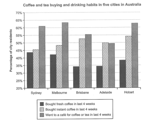
The chart below shows the results of a survey about people’s coffee and tea buying and drinking habits in five Australian cities.
Summarize the information by selecting and reporting the main features, and make comparisons where relevant.
Student answer (Band 6.0)
In the given bar graph shows a survey of coffee and tea drinking and buying partten of a month in five leading cities of Australia which are Sydney, Melbourne, Brisbane, Adelaide, and Hobart.
Firstly the chart shows that majoritiy of people perfer drinking tea or coffee from a cafe as, Melbourne and Hobart both have a high rate of people visiting cafe for tea and coffee which is around 63% of the people. Following them Sydney is the city with second highest for people visiting cafe which is around 61%. afterwards the 55% people of Brisbane city visit cafes for coffee and tea. And Adelaide is the city were 49% of people visiting cafes our a little less than people buying instant coffee. Secondly, the chart shows Hobart and Brisbanee have the highest peolpe buying instant coffee among all the cites. Following them Adelaide and Melbourne both have almost same amount of people buying instant coffee where Adelaide is at 50% and Melbourne at 48%. At last, sydney is the lowest in the terms of instant coffee bought at 45%.
At last people buying fresh coffee are the least in all states. In which Melbourne and Sydney have the most people drinking fresh coffee. following them Hobart which have 37% of people buying fresh coffee and at last Brisbane and Adelaide have same amount of people buying fresh coffee which is at 34%.
Overall it is obserevd form chart mopst people vist cafes in all 5 states and moderate amount of people buy instant coffee and at last very less people buy fresh coffe
AI examiner evaluation
| Criterion | Band |
|---|---|
| Task Achievement / Task Response | 6.5 |
| Coherence and Cohesion | 6.5 |
| Lexical Resource | 5.5 |
| Grammatical Range and Accuracy | 5.0 |
| Overall | 6.0 |
Task Achievement / Task Response: Band 6.5
You cover all three measures and make relevant comparisons across the five cities. Your overview identifies the broad pattern that café visits are generally most common and fresh-coffee purchases least common, while the body includes useful figures such as Sydney’s 61% café rate and Adelaide’s roughly 50% instant-coffee rate. Most reported values and rankings are consistent with the chart. However, some details are inaccurate or imprecise: Melbourne, not both Melbourne and Hobart, has the highest café figure (about 63.5% versus Hobart’s 63%); Hobart’s fresh-coffee figure is about 38.5%, not 37%; and Sydney, rather than Melbourne, is highest for fresh coffee. The overview also says “all 5 states” and “very less,” which overgeneralises or obscures the comparisons. More precise reporting would strengthen the response.
Coherence and Cohesion: Band 6.5
The response has a clear overall arrangement: an introduction, a paragraph on café visits and instant coffee, a paragraph on fresh coffee, and a concluding overview. Sequencing phrases such as “Firstly,” “Following them,” and “At last” help the reader follow the comparisons, and the information is generally grouped by category. However, these connectors are sometimes mechanical or repetitive, and the long middle paragraph moves between two measures without a clear break. Some links between claims are also awkward, as in “Adelaide is the city were 49% of people visiting cafes our a little less than people buying instant coffee.” The final overview repeats earlier points rather than synthesising the main contrasts. Use clearer topic sentences and more varied, precise linking to make progression smoother.
Lexical Resource: Band 5.5
You use relevant task vocabulary, including “survey,” “rate,” “instant coffee,” “fresh coffee,” and “highest,” so the main information is usually understandable. There is also some attempt to vary expressions, for example “Following them” and “in the terms of.” However, spelling errors are frequent and noticeable, including “partten,” “majoritiy,” “perfer,” “Brisbanee,” and “obserevd.” Several word choices or collocations are unnatural, such as “people drinking fresh coffee” when the chart reports buying it, “leading cities,” and “very less people.” These issues limit precision and make the writing less fluent. Build a reliable set of chart-reporting phrases and check spelling carefully; prefer exact verbs such as “bought” and “visited” over broader or mismatched wording.
Grammatical Range and Accuracy: Band 5.0
You attempt both simple and more extended sentence forms, and the reader can usually understand the comparisons. Nevertheless, control of sentence structure and basic grammar is inconsistent. The opening fragment, “In the given bar graph shows,” lacks a grammatical subject construction; “Melbourne and Hobart both have a high rate … which is around 63%” has an unclear relative reference; and “Brisbane and Adelaide have same amount” is missing an article. There are also problems with agreement and verb forms, for example “Hobart which have” and “people visiting cafes,” where a complete clause needs a finite verb. Punctuation and sentence boundaries are sometimes weak, especially where several claims are joined with “and.” Practise complete subject–verb clauses and check articles, agreement, and punctuation in each sentence.
See this exact question answered at other band scores. The same prompt compared across bands.
Browse more IELTS Writing model answers or get your own writing scored by the same AI examiner.