Band 5.0 IELTS Writing Task 1 Model Answer
Overall Band Score: 5.0 · Cambridge IELTS 15 · 2026-11-16
IELTS Writing Task 1 question
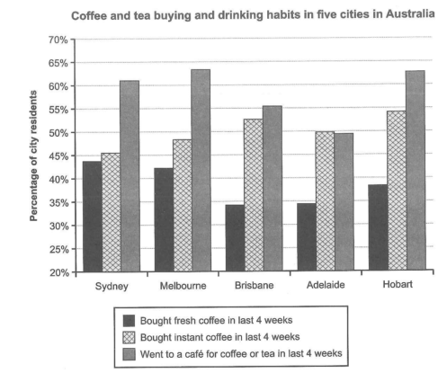
The chart below shows the results of a survey about people’s coffee and tea buying and drinking habits in five Australian cities.
Summarize the information by selecting and reporting the main features, and make comparisons where relevant.
Student answer (Band 5.0)
The bar graph represents the buying and drinking habits of some of people living in five cities of australia for tea and coffee.
Overall,more than 50% of people went to a cafe for coffee or tea in last 4 weeks and throughout the period the percentage keeps increasing close to 65%.Despite that sydney has the highest percentage op people to who brought fresh coffee in last 4 weeks and this percnetagess keeps decreasing i all other countries.more than 50% of people in Hobart brought instant coffee in last 4 weeks but the number and the number keeps on decresing about an estimate of 2-4% in every city.
The lowest percent of people that brought fresh coffee in last 4 weeks are from brisbane and the highest number goes 44% in sydney. the highest number of people that bought instant coffee is from hobart and the lowest ppercentage goes to sydney.
Melbourne is the highest when it comes to people going to the cafe for coffee or tea in last 4 weeks and the percentage drops backe the lowest in adelaide.
AI examiner evaluation
| Criterion | Band |
|---|---|
| Task Achievement / Task Response | 5.5 |
| Coherence and Cohesion | 5.0 |
| Lexical Resource | 5.0 |
| Grammatical Range and Accuracy | 5.0 |
| Overall | 5.0 |
Task Achievement / Task Response: Band 5.5
You identify several relevant headline features: café visits are generally the most popular activity, Hobart has the highest instant-coffee figure, and Adelaide has the lowest café figure. You also give some comparisons, such as fresh coffee being highest in Sydney and lowest in Brisbane. However, the overview is not consistently accurate: café attendance does not “keep increasing” across the cities, since it falls from Melbourne to Adelaide before the high figure in Hobart. The claim that fresh-coffee percentages keep decreasing after Sydney is also incorrect, as Hobart’s figure rises above Brisbane’s and Adelaide’s. Develop a clearer overview of the main contrasts and report selected figures accurately to make the summary more complete.
Coherence and Cohesion: Band 5.0
The response has a basic structure, moving from an overview to comparisons of the three activities, and the reader can identify the main subject throughout. However, progression is uneven: the overview combines several claims without clearly separating the key trends, and the later paragraphs repeat points already mentioned, such as the highest and lowest figures. Linking is limited, with “Despite that” and “and” doing much of the work; some connections are unclear, particularly “but the number and the number keeps on decreasing.” Organise the response into a concise overview followed by grouped comparisons, and use clear references and transitions to show how each city’s figures relate.
Lexical Resource: Band 5.0
You use relevant task vocabulary, including “percentage,” “highest,” “lowest,” and “bought instant coffee,” so the topic is generally understandable. However, the range is limited and several word choices or collocations are inaccurate or repetitive. For example, “countries” is used where you mean cities, “the number goes” is awkward for describing a percentage, and “percentage drops backe the lowest” does not express the comparison clearly. Spelling errors such as “percnetagess,” “decresing,” and “ppercentage” are noticeable and can distract the reader. Use precise chart language consistently, such as “the proportion of residents,” “stood at,” and “declined to,” and check spelling carefully.
Grammatical Range and Accuracy: Band 5.0
You attempt both simple and more extended sentences, including a contrast introduced by “Despite that” and clauses beginning “when it comes to.” However, errors are frequent and sometimes make relationships between ideas difficult to follow. Examples include “some of people living,” “the percentage keeps increasing,” and “the lowest percent … are,” which show problems with articles, agreement, and verb forms. Sentence boundaries and punctuation are also inconsistent: “Overall,more” and “65%.Despite” lack spaces, while the long overview sentence joins several claims without clear control. Practise accurate sentence patterns for describing chart data, especially “the percentage of residents who…” and past-tense forms such as “stood at” or “was highest.”
See this exact question answered at other band scores. The same prompt compared across bands.
Browse more IELTS Writing model answers or get your own writing scored by the same AI examiner.