Band 5.0 IELTS Writing Task 1 Model Answer
Overall Band Score: 5.0 · Cambridge IELTS 15 · 2026-11-17
IELTS Writing Task 1 question
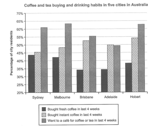
The chart below shows the results of a survey about people’s coffee and tea buying and drinking habits in five Australian cities.
Summarize the information by selecting and reporting the main features, and make comparisons where relevant.
Student answer (Band 5.0)
The bar graph compares the survay of some individuals by buying and drinking coffee and tea in the five most popupar cities in Australia.
Overall, that is shown that coffee and tea is most popular in Melbourne and Hobart upto 63% in last four weeks, while in Brisbane and Adelaide buying fresh instant coffee is in lowest in the comparison chart which in about 34%. Additionally, upto 50% of costumers bought instant coffee in the last 4 weeks in Brisbane and Hobart. Therfore the buyers are more tend to buy coffee and tea in Melbourne and Hobart and been sale 63% in a month.
Combining everything i certainly believe that the owners should work on the reviews of the costumers and should make a better choice for career that can be helpul for the future sales and bussiness costumers trust as well and can make a better option in coffee and tea.
AI examiner evaluation
| Criterion | Band |
|---|---|
| Task Achievement / Task Response | 4.5 |
| Coherence and Cohesion | 4.5 |
| Lexical Resource | 5.0 |
| Grammatical Range and Accuracy | 5.0 |
| Overall | 5.0 |
Task Achievement / Task Response: Band 4.5
You identify the chart’s general subject and notice some relevant patterns, including café visits being highest in Melbourne and Hobart and fresh coffee purchases being relatively low in Brisbane and Adelaide. However, the overview is unclear and includes inaccurate or confused comparisons: café attendance is also high in Sydney, and the statement that instant coffee was bought by “upto 50%” in Brisbane and Hobart conflicts with the chart, where both figures are above 50%. The response also shifts to advice about business owners and customer reviews, which is not requested and does not describe the data. To improve, give a concise overview of the main contrasts, then accurately compare the three categories across the cities using selected figures.
Coherence and Cohesion: Band 4.5
There is an attempt to organise the response with an opening, an overview beginning “Overall,” and a concluding paragraph. However, the ideas do not progress clearly: the overview combines several comparisons in a confusing way, and the final paragraph about owners, reviews and future sales breaks away from the chart description. Linking expressions such as “Additionally” and “Combining everything” are used, but they do not establish clear relationships between the points. The response would be easier to follow if it used a short introduction, a focused overview, and body paragraphs grouped by purchase type or by city, with each comparison connected directly to the relevant figures.
Lexical Resource: Band 5.0
The response uses some task-related vocabulary, including “bar graph,” “popular,” “bought,” and “in the last 4 weeks,” so the topic is generally recognisable. However, the range is limited and several word choices or collocations are inaccurate, such as “survay of some individuals,” “buyers are more tend to buy,” and “been sale 63%.” Spelling errors, including “survay,” “popupar,” “Therfore,” “costumers,” and “bussiness,” also make the writing less clear. Use precise chart language such as “the proportion of residents,” “purchased instant coffee,” and “visited a café.” Avoid introducing unrelated business vocabulary that does not help describe the data.
Grammatical Range and Accuracy: Band 5.0
You attempt more than simple statements, for example with “while” and “Additionally,” but the range of sentence structures is limited and complex attempts are often faulty. Examples include “that is shown that coffee and tea is most popular,” where the clause structure and subject–verb agreement are incorrect, and “buyers are more tend to buy,” which has an incorrect verb pattern. The sentence beginning “Combining everything” is also difficult to interpret because its clauses are not clearly connected. These errors sometimes make the intended comparisons hard to understand. Practise accurate patterns such as “The chart shows that…” and “The proportion who visited a café was higher in…” before adding longer sentences.
See this exact question answered at other band scores. The same prompt compared across bands.
Browse more IELTS Writing model answers or get your own writing scored by the same AI examiner.