Band 4.5 IELTS Writing Task 1 Model Answer
Overall Band Score: 4.5 · Cambridge IELTS 15 · 2026-11-17
IELTS Writing Task 1 question
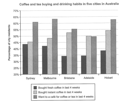
The chart below shows the results of a survey about people’s coffee and tea buying and drinking habits in five Australian cities.
Summarize the information by selecting and reporting the main features, and make comparisons where relevant.
Student answer (Band 4.5)
This chart present data about numer of cities in Australia buying and consumption habit of coffee and tea.The data is about the 4 weeks categories into 3 groups either bought fresh coffe, bought instant coffee and went to a cafe for coffee or tea. and selection of five Australian cities sydney, Melbourne,brisbane, Adelaide,hobart. Consequently,bought fresh coffee is last four weeks is decline movement is the chart from first one to four countries while afterward its been increase. while bought instant coffee in last four weeks has been normal increase in percentage from 45% to 52% approximately then it decreased in next year and afterwards it reached towards the 54% subsequently. This chart present data shows a large quantity of people went to cafe for coffee or tea instead of other opportunities but it decrease in third and fourth cities after that it increases and reached to the 63% of total percentage.
AI examiner evaluation
| Criterion | Band |
|---|---|
| Task Achievement / Task Response | 4.5 |
| Coherence and Cohesion | 4.0 |
| Lexical Resource | 5.0 |
| Grammatical Range and Accuracy | 5.0 |
| Overall | 4.5 |
Task Achievement / Task Response: Band 4.5
You identify the chart’s three categories and name all five cities, and you attempt to describe broad movements. However, the account only partially reports the main features and includes an inaccurate trend: fresh-coffee purchases do not decline from the first to the fourth city and then rise; they fall from Sydney to Brisbane, remain about the same in Adelaide, and rise in Hobart. The instant-coffee figures also do not show a steady increase followed by a decrease: they rise overall from Sydney to Hobart, with a dip in Adelaide. You correctly note that café visits are generally high and that Adelaide is lower, but the overview is vague and does not clearly compare the categories. Select the highest and lowest values and describe the main contrasts accurately.
Coherence and Cohesion: Band 4.0
The response has a basic sequence: it introduces the chart, discusses fresh and instant coffee, and then mentions café visits. This gives the reader some sense of the categories being covered. However, the ideas are packed into one paragraph, and the progression is difficult to follow because several sentences combine multiple points without clear boundaries. Connectors such as “Consequently,” “while,” and “afterwards” are either awkward or do not clearly show the relationship between the data. The repeated opening “This chart present data” also makes the organisation feel repetitive. Use a separate overview and group the details into clear comparisons, such as coffee purchases first and café visits second, with linking phrases that accurately signal contrast or sequence.
Lexical Resource: Band 5.0
You use some relevant chart vocabulary, including “percentage,” “categories,” “decline,” and “increase,” and the reader can generally identify the subject of each sentence. However, the range is limited and several word choices or combinations are unnatural, such as “normal increase,” “decline movement,” “large quantity of people,” and “reached towards.” Spelling errors, including “numer,” “coffe,” and “cafe,” also reduce accuracy. Some expressions are imprecise for describing a bar chart: “opportunities” does not clearly refer to the other activities, and “next year” is inappropriate because the chart compares cities, not years. Build a more precise set of terms for describing proportions and comparisons, and check spelling and collocations.
Grammatical Range and Accuracy: Band 5.0
You attempt longer sentences and use some clauses to connect ideas, for example, “while bought instant coffee…” and “after that it increases.” However, the range is limited, and errors occur frequently enough to make parts of the response difficult to interpret. Examples include “This chart present data,” where subject–verb agreement is missing, and “bought fresh coffee is last four weeks is decline movement,” where the sentence structure and verb forms are unclear. Several sentences also run together without appropriate punctuation, particularly the opening. Use shorter, complete sentences with a clear subject and verb, and practise accurate past-tense reporting patterns such as “the proportion rose” or “the figure was lower.”
See this exact question answered at other band scores. The same prompt compared across bands.
Browse more IELTS Writing model answers or get your own writing scored by the same AI examiner.