Band 5.0 IELTS Writing Task 1 Model Answer
Overall Band Score: 5.0 · Cambridge IELTS 15 · 2026-11-17
IELTS Writing Task 1 question
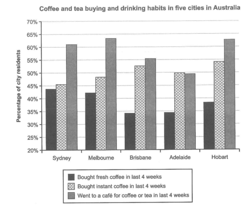
The chart below shows the results of a survey about people’s coffee and tea buying and drinking habits in five Australian cities.
Summarize the information by selecting and reporting the main features, and make comparisons where relevant.
Student answer (Band 5.0)
The bar chart above illustrates the habits of drinking and buying coffee and tea in five cities in Australia.
There are three categories mentioned that are the percentage of people bought fresh coffee in last four weeks, the percentage of people bought instant coffee and the percentage of people went to a cafe for coffee or tea in last four weeks.
In Sydney in last four weeks round about 43% people bought fresh coffee and 46% are those who bought instant coffee and at last highest with round about 61% people who went to cafe. Moreover, in Melbourne, 42% people bought fresh coffee and 48% bought instant coffee and with highest among all cities 63% people went to cafe. In Brisbane the lowest among all cities with 33% people bought fresh coffee and 53% bought instant coffee and 56% went to cafe. In Adelaide, 34% bought fresh coffee and 50% bought instant coffee and with the lowest among all cities 49% people went to cafe. In Hobart, 36% of people bought fresh coffee and with the highest among all 54% people bought instant coffee and 62% of people went to cafe.
AI examiner evaluation
| Criterion | Band |
|---|---|
| Task Achievement / Task Response | 4.5 |
| Coherence and Cohesion | 5.5 |
| Lexical Resource | 5.5 |
| Grammatical Range and Accuracy | 5.0 |
| Overall | 5.0 |
Task Achievement / Task Response: Band 4.5
You identify all three survey categories and report figures for each of the five cities, so the response is relevant and includes substantial detail. However, it mainly lists city-by-city numbers rather than selecting and summarising the most important patterns. There is no clear overview of the chart’s main features—for example, café visits were the highest activity in four cities, while instant coffee purchases led in Brisbane and Hobart. Some comparisons are also inaccurate: Melbourne’s café figure is not the highest (Hobart is marginally lower, while Melbourne is slightly higher), and Brisbane did not have the lowest fresh-coffee figure; Adelaide did. A concise overview and more accurate comparisons would make the summary more complete.
Coherence and Cohesion: Band 5.5
The response follows a generally understandable order, moving through the cities from Sydney to Hobart, and the reader can usually connect each set of figures to its location. However, this city-by-city sequence becomes repetitive, with several sentences built around the same pattern: “In [city]… [percentage] people bought…” The opening also spends space restating the chart categories rather than establishing a clear overview. Linking expressions such as “Moreover” and “and at last” do not always show the relationship between the data clearly. Grouping the cities by a shared pattern—for example, those where café visits were most common—and using a separate overview would create clearer progression and more effective cohesion.
Lexical Resource: Band 5.5
Your vocabulary is sufficient to identify the chart’s categories and communicate the figures, using relevant terms such as “percentage,” “fresh coffee,” “instant coffee” and “went to a cafe.” However, the range is limited and several phrases are repetitive or imprecise, including “people bought” and “with highest among all cities.” Some collocations are awkward, such as “at last highest,” and “habits of drinking and buying” does not accurately describe the chart as clearly as “purchasing and café-going habits.” Use a wider range of precise reporting language, such as “accounted for,” “recorded,” “was the most popular activity” and “the proportion of residents.” This would make comparisons more natural and concise.
Grammatical Range and Accuracy: Band 5.0
The response communicates the main figures, but grammatical control is uneven. Several sentences omit necessary grammatical elements, as in “the percentage of people bought fresh coffee” and “43% people bought fresh coffee”; these need structures such as “the percentage of people who bought…” and “43% of people bought…”. There are also problems with verb forms and sentence construction in phrases such as “and with highest among all cities 63% people went to cafe.” Most sentences use a similar simple pattern, with limited variety in complex structures. Practise accurate relative clauses and comparison sentences, and check articles, prepositions and sentence boundaries. More controlled structures would make the data easier to follow.
See this exact question answered at other band scores. The same prompt compared across bands.
Browse more IELTS Writing model answers or get your own writing scored by the same AI examiner.