Band 5.0 IELTS Writing Task 1 Model Answer
Overall Band Score: 5.0 · Cambridge IELTS 15 · 2026-11-17
IELTS Writing Task 1 question
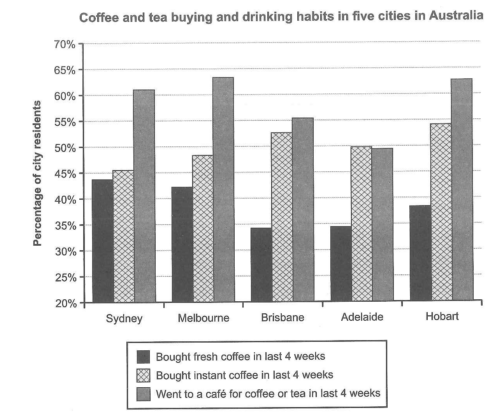
The chart below shows the results of a survey about people’s coffee and tea buying and drinking habits in five Australian cities.
Summarize the information by selecting and reporting the main features, and make comparisons where relevant.
Student answer (Band 5.0)
This bar graph present the data of people,s coffee and tea drinking habbits in last four weeks in different cities of Australia. On Y axis placed the cities names while catogories Fresh coffee, instant coffee and tea is displayed on the X axis. The data presented in percentages of the city residents. Greater number 60% citizen use to went Cafe in sydney, Melbourne and Hobert. on the other hand about equal proportion of citizen from the cities like Brisbane and Adelaide went cafe and bought coffee. overall the citizen who bought instant coffee is constant in all cities with little variation. on contrast very lesser percentage of city resident us to bought fresh coffee the maximum range is less then 45% inthe Sydney and the minimum in two cities Brisbane and Adelaide of less then 35%. color coding is given to different catogories to distinguish from each other and making bar graph more clear.
AI examiner evaluation
| Criterion | Band |
|---|---|
| Task Achievement / Task Response | 5.5 |
| Coherence and Cohesion | 5.0 |
| Lexical Resource | 5.0 |
| Grammatical Range and Accuracy | 5.0 |
| Overall | 5.0 |
Task Achievement / Task Response: Band 5.5
You identify the chart’s subject and report several relevant comparisons, including café visits being highest in Melbourne and Hobart and fresh-coffee purchases being lower in Brisbane and Adelaide. However, the overview is not consistently accurate: instant-coffee purchases are described as “constant,” although they vary from about 45.5% to 54.5%, and the café figures in Sydney, Melbourne and Hobart are not all “greater number 60%” in the way stated. The claim that Brisbane and Adelaide had about equal proportions for café visits and coffee buying is also too broad, since the three categories differ notably in Brisbane. To strengthen the response, give a clear overview of the main patterns and support it with accurate, selective comparisons across all three categories.
Coherence and Cohesion: Band 5.0
The response contains relevant information and uses a few linking expressions, such as “on the other hand” and “on contrast,” to signal comparisons. However, it is presented as one continuous paragraph, so the overview and supporting details are not clearly separated. The ideas also move abruptly from café visits to instant coffee, then fresh coffee, before ending with a comment about the chart’s colours; this final observation does not help summarise the data. Some connections are unclear, particularly the statement about Brisbane and Adelaide having “about equal proportion.” Organise the response into a brief introduction, an overview of the main trends, and a paragraph comparing key figures. Use linking words only where they accurately show the relationship between the data.
Lexical Resource: Band 5.0
You use some task-relevant vocabulary, including “percentage,” “proportion,” “categories,” and “variation,” and the reader can generally identify the three types of behaviour being compared. However, the range is limited and several word choices or collocations are inaccurate, such as “use to went Cafe,” “constant in all cities,” and “very lesser percentage.” Spelling errors, including “habbits,” “catogories,” and “Hobert,” also reduce precision. Aim for standard chart language and accurate forms: for example, say residents “visited a café,” figures “varied slightly,” and a proportion was “lower.” Check spelling carefully and avoid describing the chart’s colour coding when space is better used for comparisons.
Grammatical Range and Accuracy: Band 5.0
The response attempts to combine ideas using longer sentences and comparison clauses, but control is inconsistent, and many sentences contain errors that make the relationships between ideas difficult to follow. For example, “This bar graph present” has subject–verb disagreement, while “citizen use to went Cafe” combines an incorrect verb form with an unclear sentence structure. There are also problems with articles and plurals in “on Y axis placed the cities names” and with sentence boundaries and capitalisation. Most statements follow a simple pattern, with limited accurate variety. Build clear sentences with a subject and verb, such as “The chart shows the percentages of residents who…,” and check agreement, verb forms, articles, and punctuation before submitting.
See this exact question answered at other band scores. The same prompt compared across bands.
Browse more IELTS Writing model answers or get your own writing scored by the same AI examiner.