Band 5.5 IELTS Writing Task 1 Model Answer
Overall Band Score: 5.5 · Cambridge IELTS 15 · 2026-11-17
IELTS Writing Task 1 question
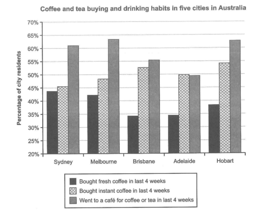
The chart below shows the results of a survey about people’s coffee and tea buying and drinking habits in five Australian cities.
Summarize the information by selecting and reporting the main features, and make comparisons where relevant.
Student answer (Band 5.5)
The bar chart depicts the outcomes of a questionare of how often people buy and drink a different types of coffe in Sydney, Melbourne, Brisbane, Adelaide, and Hobart of Australia.
The first option is bought fresh coffe in last 4 weeks. In Sydney has 43.7 percent of city residents and has almost the same amount as Melbourne which is 42.2 percent. Brisbane and Adelaide have a nearly same amount, 34.2% and 34.4%. Next, Hobart has 38.3%
The second line is bought instant coffe in last 4 weeks. Brisbane has 52.6 percent. other two cities that have amost the same number are Adelaide, 49.8%, and Melbourney, 48.3%. The lowest number is 45.5 percent of Sydney and the highest is 54.1% of Hobart.
The last option of the survey shows the percentage of city residents that went a cafe' for coffe or tea in last 4 weeks. In Sydney, people went to acafe' for coffe or tea in last 4 weeks 61% of city residents. In Brisbane, citizens went to a cafe' for coffe of tea in last 4 weeks 55.4 percent. The lowest is Adelaide that shows 49.9 % of city residents. In Hobart, people went cafe' for coffe of tea in last 4 weeks 62.7%. The highest is Melbourne that shows 63.3 percent.
In conclusion, the highest number of the survey is the percentage of city residents that went to a cafe for coffe or tea in last 4 weeks because it shows almost the highest percentage in 3 types.
AI examiner evaluation
| Criterion | Band |
|---|---|
| Task Achievement / Task Response | 5.5 |
| Coherence and Cohesion | 5.5 |
| Lexical Resource | 5.5 |
| Grammatical Range and Accuracy | 5.0 |
| Overall | 5.5 |
Task Achievement / Task Response: Band 5.5
You cover all three survey categories and report figures for each city, with most values close to the chart. Your comparisons identify useful patterns, such as similar fresh-coffee figures for Brisbane and Adelaide and the high café attendance in Melbourne and Hobart. However, the overview is not sufficiently clear or accurate: saying café visits show “almost the highest percentage in 3 types” does not explain the main overall pattern, and café attendance is not the highest category in every city. A stronger summary would state that café visits lead in four cities, while instant coffee leads in Brisbane, and that fresh coffee is generally the least popular. Also distinguish the highest and lowest values across the chart rather than mainly listing city-by-city figures.
Coherence and Cohesion: Band 5.5
The response has a recognisable structure: an introduction, separate paragraphs for the three categories, and a concluding statement. This makes the information reasonably easy to locate, and sequencing phrases such as “The second line” and “The last option” help signal the progression. However, the organisation is largely a sequence of data lists rather than a clear comparison of the main features. The conclusion repeats a broad claim without drawing together the key contrasts, and some transitions are awkward or repetitive, particularly the repeated “In [city]” constructions. Grouping the strongest comparisons—for example, the café leaders together and the lower fresh-coffee figures together—would create clearer progression and more effective cohesion.
Lexical Resource: Band 5.5
You use relevant task vocabulary, including “percentage,” “city residents,” “highest,” “lowest,” and “almost the same,” so the reader can generally understand what the figures represent. However, the range is limited and several expressions are inaccurate or unnatural, such as “outcomes of a questionare,” “a different types,” “the second line,” and “went a cafe.” Spelling errors recur in “coffe,” “questionare,” and “Melbourney,” which reduce the accuracy of the report. Repeating “in last 4 weeks” also makes the language less flexible. Use standard chart-reporting phrases such as “the proportion who visited a café” and “over the previous four weeks,” and check spelling and collocations carefully.
Grammatical Range and Accuracy: Band 5.0
You attempt both simple statements and longer comparisons, and the reader can usually follow the intended meaning. However, grammatical control is inconsistent, with frequent errors in sentence structure, articles, agreement, and prepositions. For example, “In Sydney has 43.7 percent” lacks a grammatical subject, while “a different types” has incorrect article and number agreement. Phrases such as “went a cafe” and “In Hobart, people went cafe” also omit necessary grammatical elements. Most sentences follow similar basic patterns, so the range is limited. Practise complete subject–verb sentences and accurate comparative structures, such as “The figure in Sydney was…” and “Hobart recorded a higher proportion than Sydney.”
See this exact question answered at other band scores. The same prompt compared across bands.
Browse more IELTS Writing model answers or get your own writing scored by the same AI examiner.