Band 6.0 IELTS Writing Task 1 Model Answer
Overall Band Score: 6.0 · Cambridge IELTS 15 · 2026-11-17
IELTS Writing Task 1 question
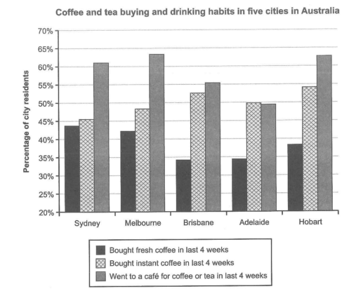
The chart below shows the results of a survey about people’s coffee and tea buying and drinking habits in five Australian cities.
Summarize the information by selecting and reporting the main features, and make comparisons where relevant.
Student answer (Band 6.0)
The graph display people's purchashing and drinking habit of hot beverages in five major cities of Australia.
Overall, the data gives the trend of percentages of residents in each city which buy fresh or instant coffee and they visit cafe for coffee and tea in last 28 days.
Sydney has 40% of fresh, 46% of instant coffee user and 62% visit cafe in last 4 weeks. These numbers are more or less the same for Melbourne with only 3% tolerance. Brisbane has lowest consumer of fresh coffee about 33% ,while second highest usage of instant one around 53%, and 56% visit cafe for these drinks. Adelaide has same intake of fresh coffee approximately 33%, instant coffee is used by 50% resident's their, and 49% visit cafe. In Hobart cafe visitor percentage reaches around 62%, while 38% use fresh and 54% use instant coffe which is the highest percentage among all the cities.
AI examiner evaluation
| Criterion | Band |
|---|---|
| Task Achievement / Task Response | 5.5 |
| Coherence and Cohesion | 6.0 |
| Lexical Resource | 6.0 |
| Grammatical Range and Accuracy | 5.5 |
| Overall | 6.0 |
Task Achievement / Task Response: Band 5.5
You cover all three survey categories and all five cities, and your figures are generally close to the chart. The comparisons that instant coffee was highest in Hobart and café visits were high in Melbourne and Hobart are relevant. However, the overview is not sufficiently clear: it mainly says what the data shows rather than identifying the main patterns. A stronger overview would state that café attendance is the leading activity in most cities, while instant coffee purchases exceed fresh coffee purchases in every city. Some details are also unclear or inaccurate: Sydney’s café figure is about 61%, not 62% (a minor approximation), but saying Melbourne’s numbers are “more or less the same” as Sydney’s obscures the larger difference in instant coffee and café visits. Prioritise the overall comparisons before listing city-by-city figures.
Coherence and Cohesion: Band 6.0
The response has a basic logical shape: an introduction, an overview, and then details arranged by city. This makes the information reasonably easy to follow, and the repeated city names help readers track the comparisons. However, the overview does not clearly guide the reader toward the main patterns, and the final paragraph becomes a long sequence of figures joined mainly by commas and “while.” This makes some relationships between details less clear, particularly in the Brisbane and Adelaide sentences. Use separate sentences or group cities by a shared feature—for example, compare the cities where café attendance is highest, then contrast fresh and instant coffee purchases. More precise linking and reference would make the progression smoother without relying on a list-like structure.
Lexical Resource: Band 6.0
You use a reasonable range of task-related vocabulary, including “percentages,” “consumer,” “usage,” “intake,” and “reaches,” so the meaning is generally understandable. There are, however, several inaccurate or unnatural choices that limit precision. “Purchashing” and “coffe” are spelling errors, while “fresh coffee user” and “intake of fresh coffee” are not natural ways to describe survey results. “Tolerance” is also unsuitable for describing a difference between city figures. Aim for standard chart language and accurate collocations, such as “the proportion of residents who bought” or “the percentage who visited a café.” Check spelling carefully and avoid varying terms when the alternatives do not fit the context.
Grammatical Range and Accuracy: Band 5.5
You attempt both simple and more complex sentence forms, including the overview clause beginning “which buy fresh or instant coffee” and comparisons using “while.” The main information remains understandable, but some grammatical errors affect clarity. For example, “The graph display” needs subject–verb agreement, and “the percentages of residents … which buy” has an unclear relative reference and tense. In “50% resident’s their,” the noun phrase and possessive construction are faulty; “50% of residents there” would be clearer. Several long sentences also need more controlled punctuation, especially the city-by-city list. Practise accurate agreement, articles and prepositions, and divide compound descriptions into shorter sentences while retaining some complex structures.
See this exact question answered at other band scores. The same prompt compared across bands.
Browse more IELTS Writing model answers or get your own writing scored by the same AI examiner.