Band 5.5 IELTS Writing Task 1 Model Answer
Overall Band Score: 5.5 · Cambridge IELTS 15 · 2026-11-18
IELTS Writing Task 1 question
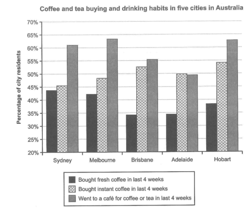
The chart below shows the results of a survey about people’s coffee and tea buying and drinking habits in five Australian cities.
Summarize the information by selecting and reporting the main features, and make comparisons where relevant.
Student answer (Band 5.5)
In this report, I am going to describe a bar chart illustrates the proportion of people drinking habits including coffee and tea buying in Sydney, Melbourne, Brisbane, Adelaide and hobart in last four weeks. The highest percentage recorded in these five cities was for people went to a cafe for coffee or tea.
In Melbourne and Hobart the highest number of people visited a cafe for coffee or tea which are near to 65%. While the lowest proportion for this was observed in Brisbane at 56% and Adelaide at 49%, here fresh coffee had least fresh coffee bought below 35%.The instant coffee rate had moderate visits and peak number was in Hobart and brisbane above 50% in both. The Sydney and Melbourne had fresh coffee visitor more than 40% .
In conclusion, the most visitor like to buy the coffee and tea f rom the cafe
AI examiner evaluation
| Criterion | Band |
|---|---|
| Task Achievement / Task Response | 5.0 |
| Coherence and Cohesion | 6.0 |
| Lexical Resource | 5.5 |
| Grammatical Range and Accuracy | 5.0 |
| Overall | 5.5 |
Task Achievement / Task Response: Band 5.0
You identify the chart’s broad pattern: café visits are generally the most popular activity, while fresh coffee purchases are comparatively low in Brisbane and Adelaide. You also include several relevant comparisons, such as café attendance in Brisbane and Adelaide and fresh coffee figures in Sydney and Melbourne. However, the report is only partially developed: it gives few precise comparisons and does not clearly summarise the full pattern across all five cities. The claim that Melbourne and Hobart have the highest café figures is inaccurate, as Melbourne and Hobart are close to 64% and Sydney is also high at about 61%; Hobart is marginally below Melbourne. The conclusion repeats the café point rather than adding a clear overview. The response is four words below the required minimum, so it needs a little more development.
Coherence and Cohesion: Band 6.0
The response has a recognisable structure, moving from an introduction to a paragraph of comparisons and then a conclusion. This gives the reader an overall route through the information. Some linking is effective, particularly the contrast introduced by “While,” and the cities are grouped in a generally relevant way. However, progression within the main paragraph is uneven: café attendance, fresh coffee and instant coffee are discussed in quick succession without a clear organising principle. The sentence beginning “While the lowest proportion…” is also joined awkwardly to the following point, and spacing and punctuation around commas are inconsistent. A clearer overview paragraph followed by a systematic comparison of the three activities would make the organisation more coherent and cohesion less mechanical.
Lexical Resource: Band 5.5
You use relevant chart vocabulary, including “proportion,” “percentage,” “highest,” “lowest” and “observed,” and the reader can generally understand which activities and cities you mean. However, the range is limited and several word combinations are unnatural or imprecise. For example, “people drinking habits including coffee and tea buying” does not clearly describe the survey categories, while “moderate visits” is not an appropriate way to describe instant-coffee purchases. “The most visitor like to buy” is also unclear, and “fresh coffee visitor” confuses purchasers with visitors. These choices sometimes make the data harder to interpret. Use precise terms such as “residents who bought instant coffee” and “the proportion who visited a café,” and check spelling and capitalisation of city names.
Grammatical Range and Accuracy: Band 5.0
You attempt both simple and more complex sentence forms, including a contrast with “While,” and the main message is usually recoverable. However, control is inconsistent, and several sentence structures are incomplete or faulty. The opening says “a bar chart illustrates” rather than using a relative clause such as “a bar chart that illustrates,” and “The highest percentage recorded… was for people went” lacks a grammatical link before “went.” The clause “In Melbourne and Hobart the highest number… which are near to 65%” has unclear agreement and reference. There are also errors in articles, verb forms and sentence boundaries, as in “people visited a cafe” and the run-on around “below 35%.The instant…”. Practise building complete clauses and checking subject–verb agreement and punctuation.
See this exact question answered at other band scores. The same prompt compared across bands.
Browse more IELTS Writing model answers or get your own writing scored by the same AI examiner.