Band 5.0 IELTS Writing Task 1 Model Answer
Overall Band Score: 5.0 · Cambridge IELTS 15 · 2026-11-20
IELTS Writing Task 1 question
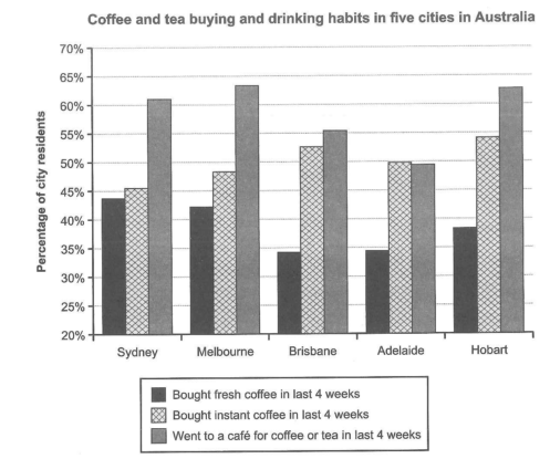
The chart below shows the results of a survey about people’s coffee and tea buying and drinking habits in five Australian cities.
Summarize the information by selecting and reporting the main features, and make comparisons where relevant.
Student answer (Band 5.0)
The bar chart compares showing the percentage of city residents, buying and drinking the coffee and tea in five different Australian cities.
Melbourne shows the the highest percentage of residents went to a cafe for coffee or tea in past 4 weeks with 63 percent. While, Hobart Sydney is at second place with 63.1%. Whereas, Brisbane and Adelaide shows a slight decrement in buying, and purchasing and intake of drinks.
Also Simultaneously, fresh coffee and instant coffee is bought in last four week and Hobart shows big most of the 54.1% resident prefer instant coffee and, whereas, 42.1% resident choose fresh coffee. In addition, Sydney has almost equal preference in both fresh and instant coffee. The ter largest fluctuation is shown in Brisbane and Adelaide with difference of almost 20 percent.
This concludes, most of the pupils shows interest in cafe for coffee, and or tea. Meanwhile, different different cities show same interest in fresh and instant coffee.
AI examiner evaluation
| Criterion | Band |
|---|---|
| Task Achievement / Task Response | 5.0 |
| Coherence and Cohesion | 5.0 |
| Lexical Resource | 5.5 |
| Grammatical Range and Accuracy | 5.0 |
| Overall | 5.0 |
Task Achievement / Task Response: Band 5.0
You identify the chart’s subject and include several relevant comparisons, such as Melbourne’s café figure and the contrast between fresh and instant coffee in Sydney. However, the overview is unclear and some key information is inaccurate: Hobart, not Melbourne, has the highest café attendance (about 63%), while Sydney is around 61%; Hobart is also about 54.5% for instant coffee, not 54.1%. The statement that Brisbane and Adelaide show a “decrement” does not clearly describe what is being compared, and the claim that their difference is almost 20 percentage points is not supported by the chart. To strengthen the response, give a clear overview of the main patterns and report accurate, directly comparable figures across the cities.
Coherence and Cohesion: Band 5.0
The response has some organisation: it begins by introducing the chart, then discusses café visits and coffee purchases, and ends with a concluding statement. However, the progression between points is difficult to follow because several comparisons are compressed or incomplete. For example, “While, Hobart Sydney is at second place” does not make clear which city ranks second, and “Also Simultaneously” combines linking expressions awkwardly. The final sentence repeats a broad idea rather than summarising the main trends. Use separate paragraphs for the overview and key comparisons, and connect each comparison explicitly—for example, contrast café attendance with instant-coffee purchases. This would make the organisation clearer and reduce confusing or repetitive transitions.
Lexical Resource: Band 5.5
You attempt a range of vocabulary related to describing data, including “percentage,” “preference,” “fluctuation,” and “difference.” However, several choices are inaccurate or unnatural for this chart, which sometimes makes the meaning unclear. “Pupils” is unsuitable because the data concerns city residents, while “decrement in buying, and purchasing and intake of drinks” is both repetitive and imprecise. “The ter largest fluctuation” also appears to be an unsuccessful attempt to describe a difference or contrast. Aim for precise chart language such as “proportion,” “share,” “was higher than,” and “the largest gap.” Check collocations and avoid using several near-synonyms together when one clear term would communicate the comparison more effectively.
Grammatical Range and Accuracy: Band 5.0
There are attempts to form longer sentences and use subordinate clauses, but complex constructions are often faulty, and errors occur frequently enough to make some comparisons hard to understand. For example, “Melbourne shows the the highest percentage of residents went” lacks a grammatical link between the two clauses, and “Brisbane and Adelaide shows” has incorrect subject–verb agreement. The sentence beginning “While, Hobart Sydney is at second place” is also incomplete and poorly punctuated. Articles, plurals, and verb forms need more consistent control, as in “in past 4 weeks” and “fresh coffee and instant coffee is bought.” Practise writing shorter, complete comparison sentences first, then combine them with accurate clauses and punctuation.
See this exact question answered at other band scores. The same prompt compared across bands.
Browse more IELTS Writing model answers or get your own writing scored by the same AI examiner.