Band 5.5 IELTS Writing Task 1 Model Answer
Overall Band Score: 5.5 · Cambridge IELTS 15 · 2026-11-20
IELTS Writing Task 1 question
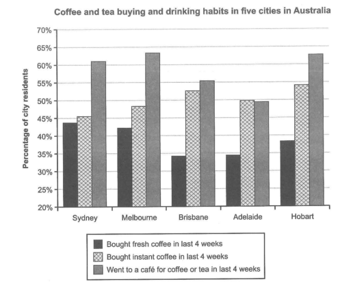
The chart below shows the results of a survey about people’s coffee and tea buying and drinking habits in five Australian cities.
Summarize the information by selecting and reporting the main features, and make comparisons where relevant.
Student answer (Band 5.5)
The bar chart illustrates the data about a survey on drinking habbit about how indivduals and society purchase coffee and tea across five Australian cities,namely as Sdney, Melbourne, Brisbane, Adelaide and Hobart.
Overall,In all of five countries the trend of visiting cafetaria for buying coffee or tea is highest meanwhile purchase of instant coffee is neutral and drinking fresh coffee in tha last 4 weeks is lowest once.
In sydney fresh coffee drinking share is at 44%,melbourne accounted for 43%,brisbane and adelaide both represents average of 34% and Hobart stood at 39%.
The people of sydney brought instant coffee in last 4 weeks was upto 45%,59% Melbourne people were into it,meanwhile brisbane is second higest trend with percentage of 53%,Adelaide made up part of 50% and at last Hobart stood at 63%.
Caffetria attracted sydney 60% of population,melbourne represents 64%,brisbane falls down at 55%,adelaide is futher dropped down at 49% and Hobart trend rised up to 63%.
AI examiner evaluation
| Criterion | Band |
|---|---|
| Task Achievement / Task Response | 5.5 |
| Coherence and Cohesion | 6.0 |
| Lexical Resource | 5.0 |
| Grammatical Range and Accuracy | 5.0 |
| Overall | 5.5 |
Task Achievement / Task Response: Band 5.5
You cover all three survey categories and all five cities, and several figures are close to the chart, such as fresh coffee in Sydney (44%) and café visits in Melbourne (about 64%). However, the overview is not fully accurate: café visits are the highest category in four cities, but in Adelaide instant coffee (50%) is slightly higher than café visits (about 49.5%). The claim that fresh coffee is lowest in every city is also incorrect in Sydney, where fresh coffee is marginally below instant coffee, and in Adelaide the café figure is lower. There is a significant data error for Hobart instant coffee: you report 63%, whereas the chart shows about 54.5%. Select the main comparisons more carefully and check each figure against the chart.
Coherence and Cohesion: Band 6.0
The response has a recognisable structure: an introduction, an overview, and separate descriptions of the three categories. This helps the reader locate the information, and the city-by-city sequence is generally consistent. However, the overview is difficult to follow because it combines several claims in one sentence, while the body lists figures without clearly comparing the cities or highlighting the most important contrasts. Some linking expressions, such as “meanwhile,” “at last,” and “further dropped down,” are used mechanically or do not express the relationship accurately. Improve progression by grouping related comparisons—for example, identify the highest and lowest café figures together—and use clear paragraphing and more precise links between ideas.
Lexical Resource: Band 5.0
You use some task-related vocabulary, including “survey,” “percentage,” “accounted for,” and “stood at,” so the topic is usually understandable. However, the range is limited and several choices are inaccurate or unnatural, such as “drinking share,” “purchase … is neutral,” “made up part of,” and “trend rised up.” These expressions make some comparisons unclear. There are also noticeable spelling errors, including “habbit,” “indivduals,” “cafetaria,” and “Caffetria,” as well as inconsistent city-name spelling (“Sdney”). Use precise chart language such as “the proportion who bought,” “was the highest,” and “fell to,” and check spelling and collocations carefully. This would make the description clearer and more appropriate to an academic report.
Grammatical Range and Accuracy: Band 5.0
You attempt both simple statements and longer sentences, and the basic meaning of most city figures can be understood. However, grammatical control is uneven, particularly in sentence construction and verb forms. For example, “The people of sydney brought instant coffee … was upto 45%” has an unclear subject and faulty agreement, while “59% Melbourne people were into it” lacks a clear grammatical relationship between the percentage and the people. The overview also contains awkward sentence structure, and punctuation is inconsistent, with missing spaces after commas and unnecessary capitals after them. Aim for complete, straightforward clauses such as “In Sydney, 45% of residents bought instant coffee,” then combine them only when the relationship between figures is clear.
See this exact question answered at other band scores. The same prompt compared across bands.
Browse more IELTS Writing model answers or get your own writing scored by the same AI examiner.