Band 4.0 IELTS Writing Task 1 Model Answer
Overall Band Score: 4.0 · Cambridge IELTS 15 · 2026-11-21
IELTS Writing Task 1 question
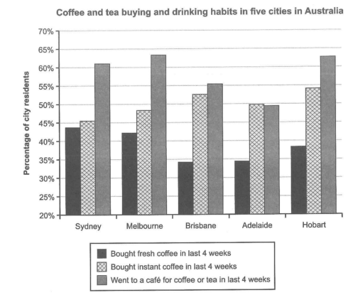
The chart below shows the results of a survey about people’s coffee and tea buying and drinking habits in five Australian cities.
Summarize the information by selecting and reporting the main features, and make comparisons where relevant.
Student answer (Band 4.0)
The given bar chart illustrates the people that was drinking coffee and tea inthe autralian five cities with thier percentage.The melbourne city of australia touch to the peak of drinkingwent to the coffee or tea in the last four weeks.
AI examiner evaluation
| Criterion | Band |
|---|---|
| Task Achievement / Task Response | 3.0 |
| Coherence and Cohesion | 3.5 |
| Lexical Resource | 4.5 |
| Grammatical Range and Accuracy | 4.5 |
| Overall | 4.0 |
Task Achievement / Task Response: Band 3.0
The response identifies the chart’s general subject and attempts to report a notable feature: Melbourne’s café attendance is high. However, it does not summarise the main patterns across the five cities or compare the three activities, and it gives no supporting figures. The claim that Melbourne “touch[es] to the peak” is also incomplete: Melbourne has the highest café figure, but Hobart is very close, and the response does not mention that instant coffee is more popular than fresh coffee in every city. The task is only minimally addressed, and the response is 110 words below the required minimum. To improve, provide an overview and select several accurate comparisons with approximate percentages.
Coherence and Cohesion: Band 3.5
There is a basic attempt to connect the response to the chart, and the second sentence appears intended to highlight a key result. However, the ideas are not developed into a clear summary: there is no overview followed by supporting comparisons, and the single paragraph offers little progression. The relationship between “drinking coffee and tea” and the later reference to café visits is also unclear. At this level, the response shows only limited organisation rather than a coherent sequence of the chart’s main information. Use a simple structure: introduce what the chart measures, state the overall trends, then compare the cities and activities in a logical order.
Lexical Resource: Band 4.5
The response uses a few relevant terms, including “bar chart,” “percentage,” “cities,” and “last four weeks,” so the topic is recognisable. However, the vocabulary is very limited and some choices are inaccurate or awkward, such as “people that was drinking” and “touch to the peak.” Spelling errors in “autralian” and “thier,” along with the joined form “inthe,” also reduce clarity. The phrase “drinking went to the coffee or tea” does not accurately express the chart’s category of going to a café. Build a small range of precise reporting language, such as “the proportion of residents,” “bought instant coffee,” and “visited a café.”
Grammatical Range and Accuracy: Band 4.5
The response attempts two sentences, including a relative clause in “people that was drinking,” but grammatical control is weak and the structures remain very limited. Subject–verb agreement is incorrect in “people that was,” while “The melbourne city … touch” has an incorrect verb form and agreement. The second sentence also lacks a clear grammatical connection between “drinking” and “went to the coffee or tea,” making the intended meaning difficult to follow. Capitalisation and sentence punctuation are inconsistent. Practise accurate simple reporting sentences first, then add controlled comparisons—for example, “The proportion of residents who visited a café was highest in Melbourne.”
See this exact question answered at other band scores. The same prompt compared across bands.
Browse more IELTS Writing model answers or get your own writing scored by the same AI examiner.