Band 5.0 IELTS Writing Task 1 Model Answer
Overall Band Score: 5.0 · Cambridge IELTS 15 · 2026-11-13
IELTS Writing Task 1 question
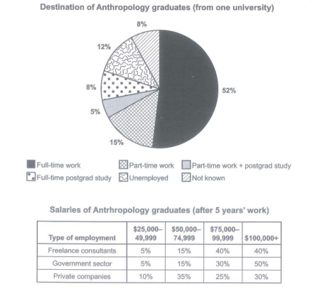
The chart below shows what Anthropology graduates from one university did after finishing their undergraduate degree course. The table shows the salaries of the anthropologists in work after five years.
Summarize the information by selecting and reporting the main features and make comparison where relevant.
Student answer (Band 5.0)
The pie chart graph defined qulified of Anthropology fron a univerity and there jobs and saleries after completion of their graduation.There are three categories of jobs freelance consultants who begun from 5% nut reaches 40% after 5 years and got salery upto 100,000$ .Whereas, employs in government sectors also starts as freelancer but grow upto 50% after 5 years with salery range respectively.private sectors offer more jobs about 10% but their progress increse just upto 30% after 5 years.Unemployment ratio for gratuated students about 12% and ratio for part timer students about 5% similarly full time postgratuated students 8% and there also 8% for unknown people.
AI examiner evaluation
| Criterion | Band |
|---|---|
| Task Achievement / Task Response | 4.5 |
| Coherence and Cohesion | 4.5 |
| Lexical Resource | 5.0 |
| Grammatical Range and Accuracy | 5.0 |
| Overall | 5.0 |
Task Achievement / Task Response: Band 4.5
You identify several relevant figures, including 52% in full-time work, 12% unemployed, and the salary-band proportions for different employment types. However, the response only partially covers the task: it gives no clear overview of the main patterns and does not accurately explain what the salary percentages represent. For example, “freelance consultants who begun from 5% nut reaches 40%” makes the table sound like a change over time, whereas it shows the distribution of salaries after five years. The government-sector and private-company figures are also described vaguely, and the 5% figure for part-time students is incorrect: it refers to graduates combining part-time work with postgraduate study. The response is 106 words, below the required 150. Add a concise overview and accurately compare the key salary bands and graduate destinations.
Coherence and Cohesion: Band 4.5
There is a basic attempt to group information: the response first discusses employment sectors and salaries, then turns to graduate destinations. Linking words such as “Whereas” and “similarly” also show an effort to connect comparisons. However, the ideas do not progress clearly, and the opening sentence combines the chart’s subject with unclear wording about jobs and salaries. The shift from salary data to unemployment and study destinations is abrupt, while “respectively” has no clear comparison to refer back to. Organise the response into a brief introduction, an overview, and separate paragraphs for destinations and salary patterns. Use clear references and connectors only where the relationship between figures is explicit.
Lexical Resource: Band 5.0
You use some task-related vocabulary, including “freelance consultants,” “government sectors,” “private sectors,” “unemployment ratio,” and “salary range,” so the reader can recognise the general subject. However, the range is limited and several word choices or forms make the meaning unclear, such as “defined qulified,” “there jobs,” “begun from,” and “progress increse.” “Ratio” is also less suitable than “proportion” for these chart percentages, and “salary” is repeatedly misspelled as “saleries” or “salery.” Aim for accurate, standard chart language and check spelling carefully. Useful terms include “accounted for,” “salary bracket,” “graduates in employment,” and “the proportion earning.”
Grammatical Range and Accuracy: Band 5.0
The response attempts some longer sentence structures, including a comparison beginning “Whereas” and a sentence using “similarly,” but control is inconsistent. Errors in verb forms and sentence construction appear in phrases such as “who begun from 5% nut reaches 40%” and “their progress increse just upto 30%.” The opening sentence lacks clear grammatical structure, and the final sentence joins several separate statistics without a well-controlled pattern. Articles, plurals, and punctuation are also unreliable, which sometimes makes relationships between the figures difficult to follow. Practise writing short, complete comparison sentences first—for example, “The proportion earning $100,000 or more was highest in the government sector”—then combine ideas using accurate clauses and punctuation.
See this exact question answered at other band scores. The same prompt compared across bands.
Browse more IELTS Writing model answers or get your own writing scored by the same AI examiner.