Band 5.5 IELTS Writing Task 1 Model Answer
Overall Band Score: 5.5 · Cambridge IELTS 15 · 2026-11-13
IELTS Writing Task 1 question
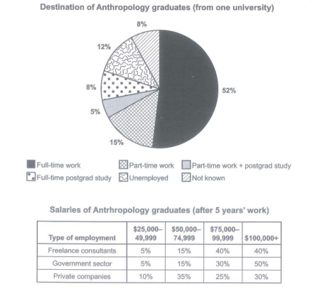
The chart below shows what Anthropology graduates from one university did after finishing their undergraduate degree course. The table shows the salaries of the anthropologists in work after five years.
Summarize the information by selecting and reporting the main features and make comparison where relevant.
Student answer (Band 5.5)
The pie charts illustrates the destination of Anthropology gradues from one university after completing their upperclassman degree, while the table their income of the anthropologists working after five years of employment.
Overall, it is clear that the majority graduates obtained full time employment, In addition after five years most anthropologists working in the government sector of the saaries highest.
Using the salaries of threshold at &75,000-99,999 in 80% of the freelance and government sector was the highly figure. And the private companies of 55% in the employee working. In the average of the salaries to &50,000-74,999 was the value of middle range. Followed by 35% in private companies, while the freelance and government sector of only 5% used incomes to %25,000-49,999. Private companies are also the increases the proportion of 10%. The largest value of governments sector in 50% to &100,000+.
The full time work had the highest proportions of 52%.followed by the part time employment of 15%, Unemployed was the destination graduates of the only 12%. And the part time work+postgrad study in the lowest point of 5%, and the full time postgrad study and the not known proportion of the same value of 8%.
AI examiner evaluation
| Criterion | Band |
|---|---|
| Task Achievement / Task Response | 6.0 |
| Coherence and Cohesion | 5.5 |
| Lexical Resource | 5.0 |
| Grammatical Range and Accuracy | 5.0 |
| Overall | 5.5 |
Task Achievement / Task Response: Band 6.0
You cover both visuals and identify the main destination correctly: full-time work is the largest category at 52%. You also report several salary figures accurately, including the government sector’s 50% in the highest band and private companies’ 35% in the $50,000–74,999 band. However, the overview is unclear and partly inaccurate: “most anthropologists working in the government sector” is not shown by the table, which compares salary distributions by employment type rather than the number of workers in each sector. The claim that 80% of freelance and government employees earned $75,000–99,999 also misreads the table: those figures are 40% and 30%, respectively. To strengthen the response, give a clear overview of the salary pattern and compare the sectors using the correct figures; some details are currently unclear or under-developed.
Coherence and Cohesion: Band 5.5
The response has a basic overall structure: an introduction, an overview, a paragraph about salaries, and a final paragraph about graduate destinations. This helps the reader distinguish the two visuals. However, progression within the salary paragraph is difficult to follow because figures and categories are mixed together, as in “Using the salaries of threshold at…” and “In the average of the salaries…”. Linking phrases such as “Followed by” and “And” are sometimes used mechanically or leave sentence fragments, while the shift from salary data back to destinations in the final paragraph feels abrupt. Organise the body into clearly ordered comparisons, and use linking words only where they show a precise relationship between the figures.
Lexical Resource: Band 5.0
You attempt task-relevant vocabulary, including “proportions,” “employment,” “destination,” and “salary threshold,” and the reader can generally identify the categories being discussed. However, the range is limited and several word choices or collocations make the meaning unclear: “upperclassman degree,” “the table their income,” and “the highly figure” do not express the intended ideas naturally. There are also spelling errors such as “gradues” and “saaries,” and inconsistent forms such as “full time” and “part time.” Use standard chart language consistently—for example, “undergraduate degree,” “shows their salaries,” and “the highest figure”—and check spelling and word forms before submitting.
Grammatical Range and Accuracy: Band 5.0
You attempt both simple and more complex sentence forms, including a contrast introduced by “while” and an overview beginning “Overall, it is clear that…”. However, control is uneven, and errors often make sentences difficult to interpret. For example, “The pie charts illustrates” has subject–verb disagreement, while “the table their income” is missing a main verb. Several later statements are fragments, including “Followed by 35% in private companies,” and punctuation is unreliable, as in “52%.followed”. Practise building complete sentences with a clear subject and verb, and check agreement, articles, and sentence boundaries. More accurate control of these basic patterns would make your comparisons much easier to understand.
See this exact question answered at other band scores. The same prompt compared across bands.
Browse more IELTS Writing model answers or get your own writing scored by the same AI examiner.