Band 6.0 IELTS Writing Task 1 Model Answer
Overall Band Score: 6.0 · Cambridge IELTS 15 · 2026-11-19
IELTS Writing Task 1 question
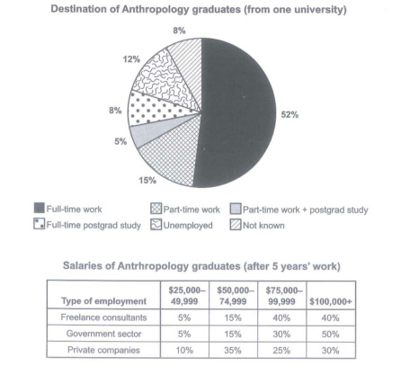
The chart below shows what Anthropology graduates from one university did after finishing their undergraduate degree course. The table shows the salaries of the anthropologists in work after five years.
Summarize the information by selecting and reporting the main features and make comparison where relevant.
Student answer (Band 6.0)
The pie chart illustrates what are the students doing currently after completing their college, while the table compares the salaries of anthropologists in different jobs, in three categories after five years.
Overall, Full-time job accounted for the largest proportion, whereas the least preferred one is part-time job with postgrad study. Almost of the categories majority of the employees earn sufficient amount.
In pie chart, full-time job recorded the largest part at 52%, making it a popular one. This was followed by part-time job at 15%, the second most preferred. In contrast, unemployed accounted for 12%. The full-time postgrad study and another not know category stood at 8% and 8%, respectively. The least chosen is part-time along with postgrad study.
Regrading the table, freelancers earning above $75,000 and $100,000+ almost 40% each. freelancers earning more than $50,000 to $74,000 stood at 15%. The five percentage of them gets salary between $25,000 to $49,999. Then coming to the government role, those categories earning $ 25,000-49,000 and $50,000-$74,999 is exactly same as like freelancers. the 10% lower in $75,000 category, In comparison, 20% in $100,000. In the private work the first two section doubled by 10% and 35%, seen a decrease in other two section 25% and 30%.
AI examiner evaluation
| Criterion | Band |
|---|---|
| Task Achievement / Task Response | 6.0 |
| Coherence and Cohesion | 6.0 |
| Lexical Resource | 6.0 |
| Grammatical Range and Accuracy | 5.5 |
| Overall | 6.0 |
Task Achievement / Task Response: Band 6.0
You cover both visuals and identify the main destination feature accurately: full-time work is the largest group at 52%, while part-time work combined with postgraduate study is the smallest at 5%. You also report several salary figures correctly, including the 40% and 40% shares for freelance consultants in the two highest bands. However, some comparisons are incomplete or unclear. For example, the overview says employees generally earn a “sufficient amount,” which is vague rather than a clear summary of the salary pattern. The government-sector figures are partly misreported: its $75,000–99,999 share is 30% and its $100,000+ share is 50%, not simply “10% lower” and “20%” without a clear reference point. Select the key contrasts and state each comparison precisely.
Coherence and Cohesion: Band 6.0
The response has a clear overall structure: an introduction, an overview, and separate paragraphs for the pie chart and salary table. This makes the two sources easy to distinguish, and sequencing phrases such as “This was followed by” and “In contrast” help guide the reader. However, cohesion is sometimes mechanical or unclear, particularly in the table paragraph. Phrases such as “Then coming to the government role” and “In the private work” do not establish precise links between the categories, while “the first two section doubled by 10% and 35%” is difficult to follow. Use a consistent comparison pattern for each employment type and refer explicitly to the salary bands, so readers can track how the figures relate.
Lexical Resource: Band 6.0
You use an adequate range of task-related vocabulary, including “accounted for,” “proportion,” “freelancers,” and “salary,” and the main information remains understandable. There are also attempts at more formal reporting language, such as “recorded the largest part.” However, several choices are imprecise or unnatural: “what are the students doing currently” suggests present activity rather than post-graduation destinations, and “sufficient amount” does not describe a measurable salary trend. “Not know category” and “the private work” are also awkward, and “Regrading” is a spelling error. Aim for standard chart language such as “destination,” “share,” “salary band,” and “private companies,” and use precise terms rather than evaluative wording like “popular” or “sufficient.”
Grammatical Range and Accuracy: Band 5.5
You attempt both simple and more complex sentence forms, and most of the intended comparisons can be understood. Some grammatical errors remain, especially in sentence construction and agreement. For example, “The pie chart illustrates what are the students doing” uses an incorrect embedded-question structure; write “illustrates what students did” or “shows the destinations of graduates.” In “those categories … is exactly same,” the verb does not agree with the plural subject, and the comparison needs a complete grammatical structure. The final sentence, “the first two section doubled by 10% and 35%, seen a decrease,” is also incomplete and unclear. Check articles, plural forms, and verb agreement, and make sure each sentence has a clear subject and finite verb.
See this exact question answered at other band scores. The same prompt compared across bands.
Browse more IELTS Writing model answers or get your own writing scored by the same AI examiner.