Band 6.0 IELTS Writing Task 1 Model Answer
Overall Band Score: 6.0 · Cambridge IELTS 18 · 2026-11-13
IELTS Writing Task 1 question
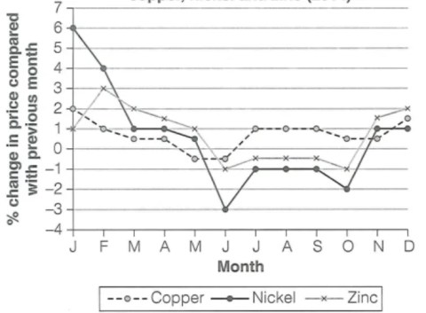
The graph below shows the average monthly change in the prices of three metals during 2014.
Summarise the information by selecting and reporting the main features, and make comparisons where relevant.
Average monthly change in prices of copper, nickel and zinc (2014)
Student answer (Band 6.0)
The line graph below illustrate the average change of prices of metals monthly in the year of 2014.
Overall, chart compared the monthly three metals prices with previous month in percentage. These metals are copper, nickel and zinc.
firstly, nickel is at highest 6% in the month of january and started to decrease gradually, until june came at -3% and then rose to -1% and remain at same rate in next two months. Afterthat, in the month of november and december its prices rose up again and got stable whole month at 1%.
In contrast, coper stayed stable throughout the year with little up and down. it started from 2% in the start of the year and at the end of year is, it was up to 1% but in the month of may and june it was down at -0.5%.
lastly, zinc which was on 1% in the beginning of the year and rose to 3% at the month of febrary. onward it price started decrease and reached -1% in the month of june and next same 4 months. it increased again in november up to 1% and end 2% in december.
AI examiner evaluation
| Criterion | Band |
|---|---|
| Task Achievement / Task Response | 6.0 |
| Coherence and Cohesion | 6.0 |
| Lexical Resource | 5.5 |
| Grammatical Range and Accuracy | 5.5 |
| Overall | 6.0 |
Task Achievement / Task Response: Band 6.0
You cover all three metals and identify several important movements, including nickel’s January peak and June low, copper’s small fluctuations, and zinc’s recovery towards the end of the year. Most reported figures broadly match the graph. However, the overview mainly explains what the chart compares rather than summarising its key pattern. Make the overall contrast explicit: nickel fluctuates most dramatically, while copper changes least, and all three fall around June before recovering later. Some details are also unclear or imprecise: nickel rises to 1% in November and remains at that level in December, rather than rising in both months; zinc is around -0.5% from July to September, not at -1% for four months. A sharper overview and more precise comparisons would strengthen the response.
Coherence and Cohesion: Band 6.0
The response has a recognisable structure, with an introduction, an overview-like paragraph, and separate sections for nickel, copper and zinc. This makes the information generally easy to follow, and transitions such as “In contrast” and “lastly” help signal movement between metals. However, the overview does not actually summarise the main trends, and the organisation by metal means shared patterns—especially the June declines and later recoveries—are not brought together. Some linking is mechanical, while “Afterthat” and “onward” do not connect ideas naturally. Capitalisation and punctuation also interrupt the flow. Grouping the main comparison in the overview, then organising details into clearer time periods, would create stronger progression and cohesion.
Lexical Resource: Band 5.5
You use relevant vocabulary for describing data, including “decrease,” “rose,” “stable,” and “up and down,” so the main trends can usually be understood. There is some variety in how you describe movement, but several choices are imprecise or unnatural for an academic graph report. For example, “prices rose up again,” “got stable whole month,” and “was on 1%” are awkward collocations; “coper” and “febrary” are spelling errors. “Stable” is also not quite accurate for nickel in November and December, when it remains at the same rate. Aim for precise reporting verbs and standard collocations, such as “increased,” “remained unchanged,” and “stood at.”
Grammatical Range and Accuracy: Band 5.5
You attempt both simple and more extended sentences, including a sequence linked with “until” and “then,” and the reader can generally understand the trends. However, some errors in sentence structure, agreement, articles and punctuation remain. For instance, “The line graph below illustrate” needs a singular verb, while “Overall, chart compared” is missing an article and has an unclear verb form. The sentence beginning “firstly, nickel is at highest” shifts into the present tense and lacks appropriate capitalisation; “in the month of may and june it was down” also needs clearer punctuation and capital letters. Use the past tense consistently for 2014 data, check subject–verb agreement, and divide long sequences into controlled sentences.
See this exact question answered at other band scores. The same prompt compared across bands.
Browse more IELTS Writing model answers or get your own writing scored by the same AI examiner.